What is the first thing parents see at the top of your school’s website? Sliders (sometimes called “carousels”) are an easy and popular choice, but are they the best choice? Giving all of your “most important” messages prime real estate feels like a win – but is it?
Spoiler alert:
Here are six reasons why you may need to ditch your website slider.
1. If Everything is Important, Nothing is Important.
Why do so many schools use sliders in the first place? Because they have so much to say, right? There’s the upcoming basketball game, an open house, news about your campus expansion project… And your job is to communicate all of it!
Adding to this challenge, each message is championed by someone who cares deeply about their announcement. The athletics director really wants to increase game attendance. The admissions office really wants to increase open house registrations. Your principal really wants to increase fundraising efforts.
Rather than determining which message is actually the most important, many turn to indecision’s best friend: the slider.
The slider promises to solve all your communication woes (and keep everyone happy).
Here’s the problem: Sliders don’t elevate any message. They dilute every message.
In an effort to say everything and please everyone, you end up:
In short: Sliders aren’t a win-win. They’re a lose-lose.
2. If You Aren’t First, You’re Last.
If your website visitor actually does stop and read the information on the first slide (and even that isn’t guaranteed!), it isn’t likely they’ll continue reading or interacting with the slides that follow.
This has been proven true time and time again. Here’s a pretty dramatic example from 2013 where research on Notre Dame’s website slider revealed these startling results.
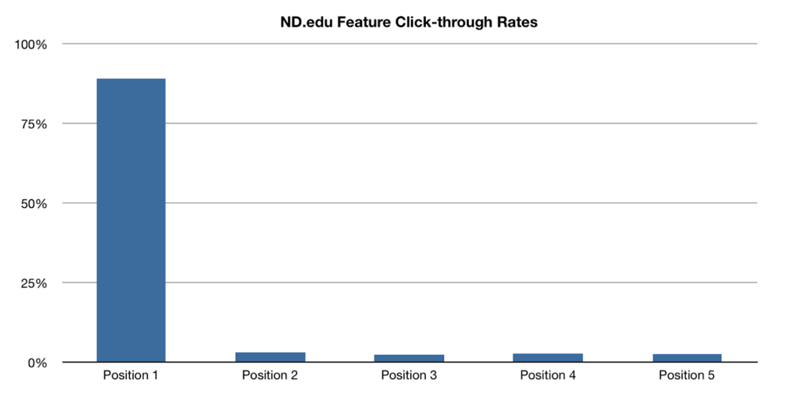
89.1% of slider clicks were on the first slide. Slides 2-5 shared the remaining 10.9% of clicks. The harsh reality with slides is, ”If you aren’t first, you’re last.”
Maybe you’re thinking, “Well, hey, we’ll just put the most important slide first! If they don’t see the other slides, it’s no big deal.”
I applaud your creative problem-solving, but here are two problems:
3. Problematic Accessibility Means Less Effective Communication.
Tools that make websites accessible for those with hearing or vision impairments, such as screen readers, have difficulty pulling information from sliders. There are endless ways that web developers can construct a slider on a webpage, and this lack of uniformity makes universal accessibility impossible. A lack of accessibility means less effective communication and alienation for those who are visually impaired.
Why are sliders so difficult to access? If the slider is designed around a “next” button that advances to the next slide, many screen readers will not be able to identify this button and make it usable. If the slides advance automatically, this can cause cognitive and visual confusion as well as mess with the screen reader technology.
Accessibility is just another example of how sliders can be a “lose-lose.” No matter how well they may seem to be constructed or how user-friendly they seem, they’re simply not able to meet the accessibility requirements you want to have on your site.
4. Design Flaws (& User Frustration) Are Magnified.
Even if a website visitor has no specific accessibility needs, improperly designed sliders can be frustrating to use. If the slides change automatically, parents may find the information they’re looking for keeps disappearing before they can read it all. The opposite may also be true: the slides may change so slowly that visitors lose interest and keep scrolling.
Any design flaw there may be on your website will be magnified on a slider. If the text is too small or too large, or if there isn’t appropriate contrast between the font color and the background, the information on the slider will be even more difficult to read and retain.
Sliders also struggle to perform on mobile devices. This is perhaps the biggest reason to avoid using sliders on your website since a dramatic amount of website visitors are using their phones or another smart device rather than a desktop computer. Mobile experience should be a huge factor in your website design.
5. Performance Killers Lead to Shorter Visits.
Did you know that sliders can actually slow down your entire website’s performance?
The last thing you want for your school is a website that is running at a less-than-optimal speed. When parents and students visit the site, they want to find the information that’s important to them as quickly as possible. A slow website is a quick way to ensure visitors close the window to look elsewhere. That slider you hoped would grab their attention may, in fact, contribute towards shortening it.
6. SEO Hits Are Blows to Your School’s Marketing Campaign.
Search Engine Optimization is obviously crucial to every Christian school website – this is what allows prospective parents to find your school when they’re looking for a school home for their family. Google uses text and other information from your website to determine which web pages to show for any given search. However, the jury is still out on whether Google’s algorithm looks at text embedded in images.
In other words, if your slider has an image with a big star and the words “Best Christian School in Texas,” Google may only see the star. If you put the same words as regular text on the page, everyone’s favorite search engine may give you a boost when someone searches that phrase.
Not convinced?
If you’re still on the fence, I invite you to check out https://shouldiuseacarousel.com/. This simple page makes the case better than I ever could.
Are Website Sliders Ever a Good Idea?
The short answer is, sometimes!
There are a few instances where a slider could work well on your website. The key is to never use a slider at the top of a page or to use it to communicate necessary information that could be missed. Upcoming event dates and details, registration and application information, upcoming school deadlines – this is the kind of information you do not want to rely on a slider to communicate to parents. The risk of the information being lost in the slider is too great.
If you really want to feature a slider on your site, there are a few ways to do it strategically. Sliders are great for showcasing photos, testimonials, quotes, and other non-essential content that gives a glimpse into your school’s life.
What’s the Alternative?
The good news is there are a lot of great ways to have a dynamic, informative home page without relying on a slider!
One idea is to have a video background at the top of the page. This gives parents and prospective students a real taste of what your school is about, along with making your website stand out among your competitors.
If you don’t have the ability to feature a video, using rotating photos can achieve a similar result. Just consider having the text stay the same instead of rotating like a traditional slider.
As a Christian school leader who meets with prospective students and parents all the time, you understand how important a first impression is. The same is true of the first impression your school’s website makes. Parents visit your website long before they ever set foot on the campus.